Striking shapes and colors position Warmington Industries as a confident leader in fastener and assembly component manufacturing.


Warmington’s strategy centers on precision, reliability, and the essential human relationships behind manufacturing. My design approach translated those qualities into a bold, contemporary brand system that conveys clarity and confidence.
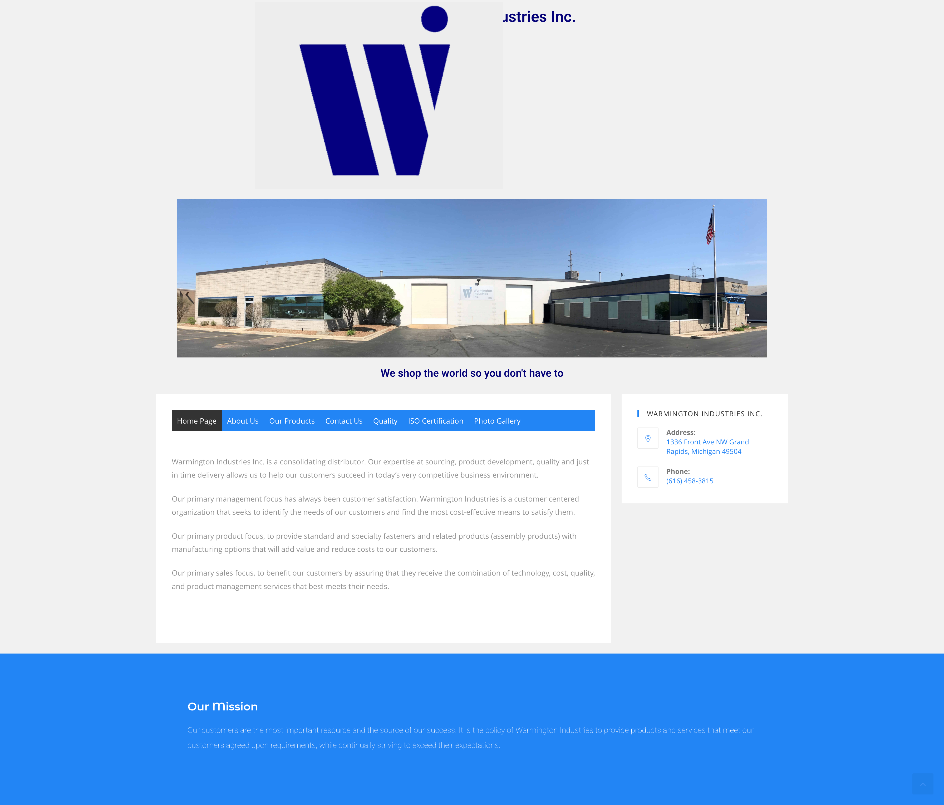
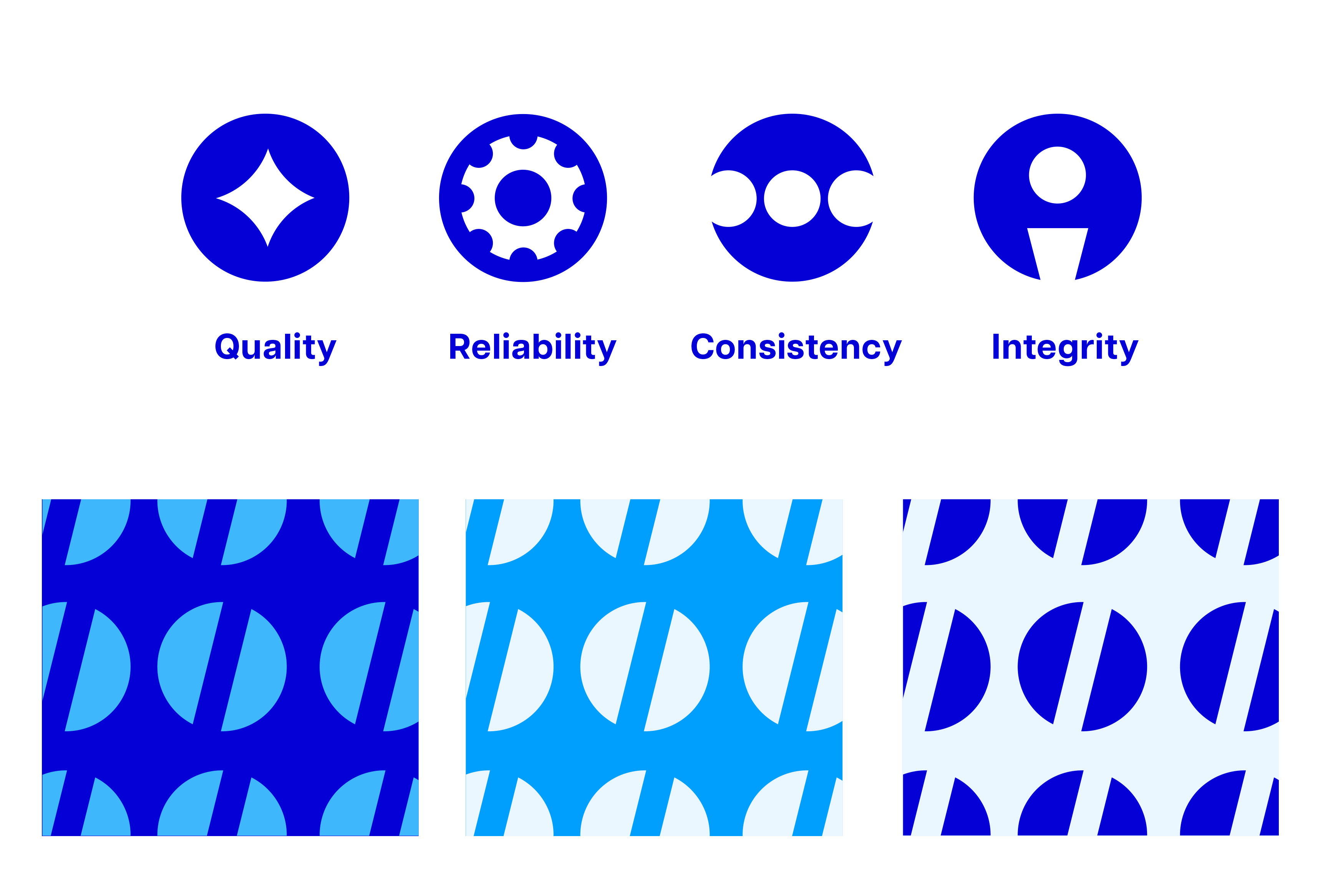
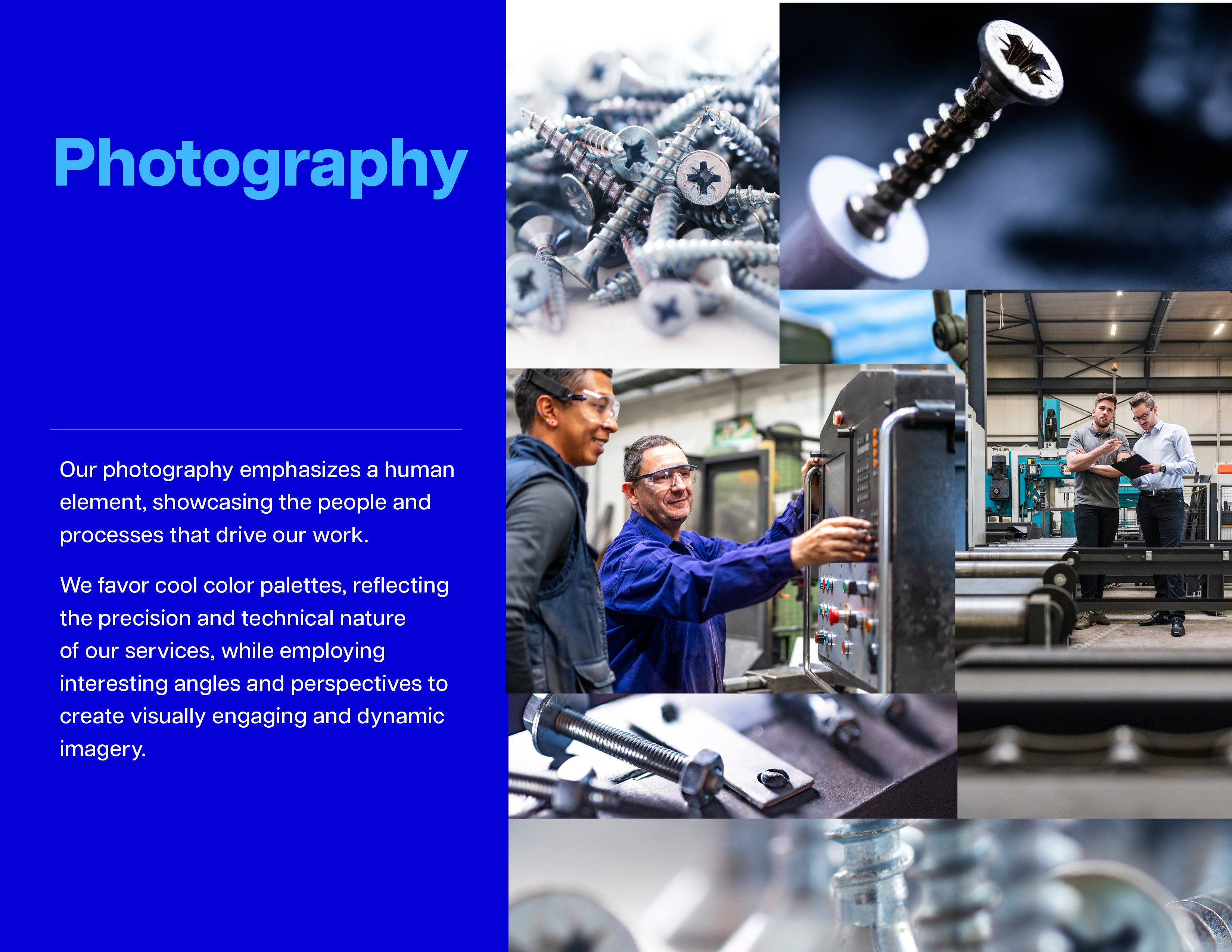
I evolved their existing “W” mark into a strong identifier and expanded it into a full visual language—clean typography, a vibrant blue palette, and geometric graphics. Cool-toned photography emphasizes both people and process, reinforcing Warmington’s expertise and human-centered service.
Together, these elements create a cohesive identity that feels technical, trustworthy, and energizing.


.png)


Let's tackle the challenges you're facing. Reach out to connect or request a proposal.