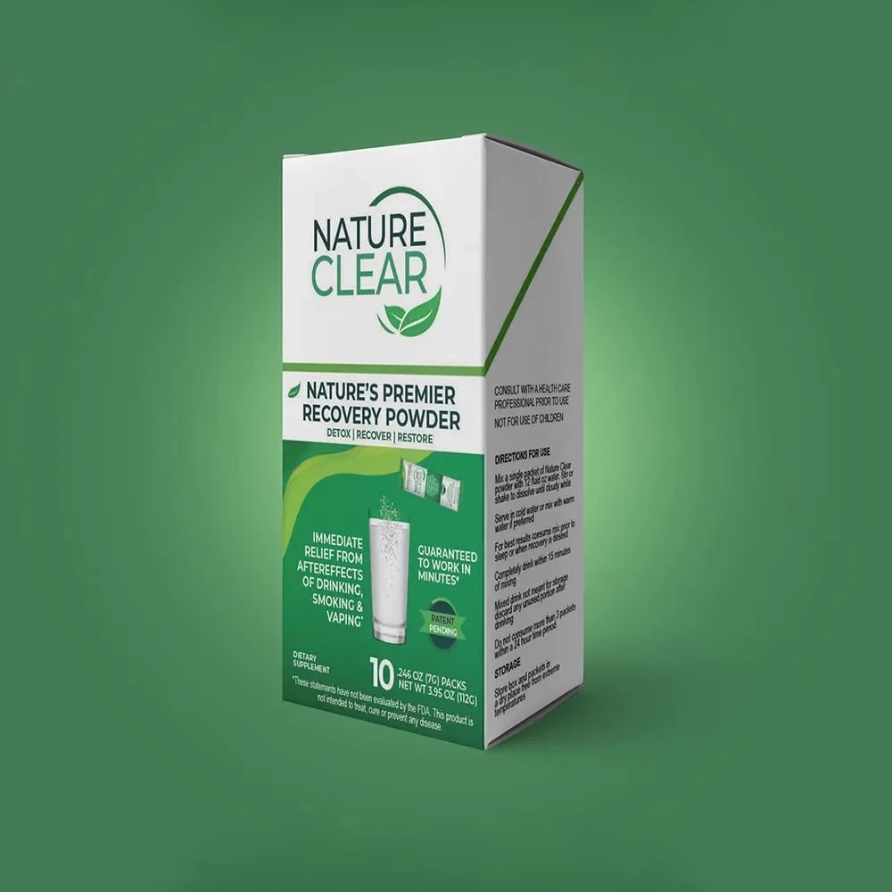
Building on early success and with a vision to rise above the competition, Nature Clear Recovery Powder set its sights on revitalizing its branding and packaging.
With a clean slate to work from, we set out to craft a distinctive identity that would stand out in a crowded marketplace, spark an emotional connection with consumers, and showcase the product’s unique benefits. I led the team to align on a brand strategy, craft a new name, and relaunch with bold, eye-catching packaging.
This project was produced in partnership with Chief Digital Advisors.
Guided by consumer insights, we developed an audience persona centered on the busy professional—someone who works hard, plays hard, and juggles a full life. They need a product that keeps them moving, without anything holding them back.
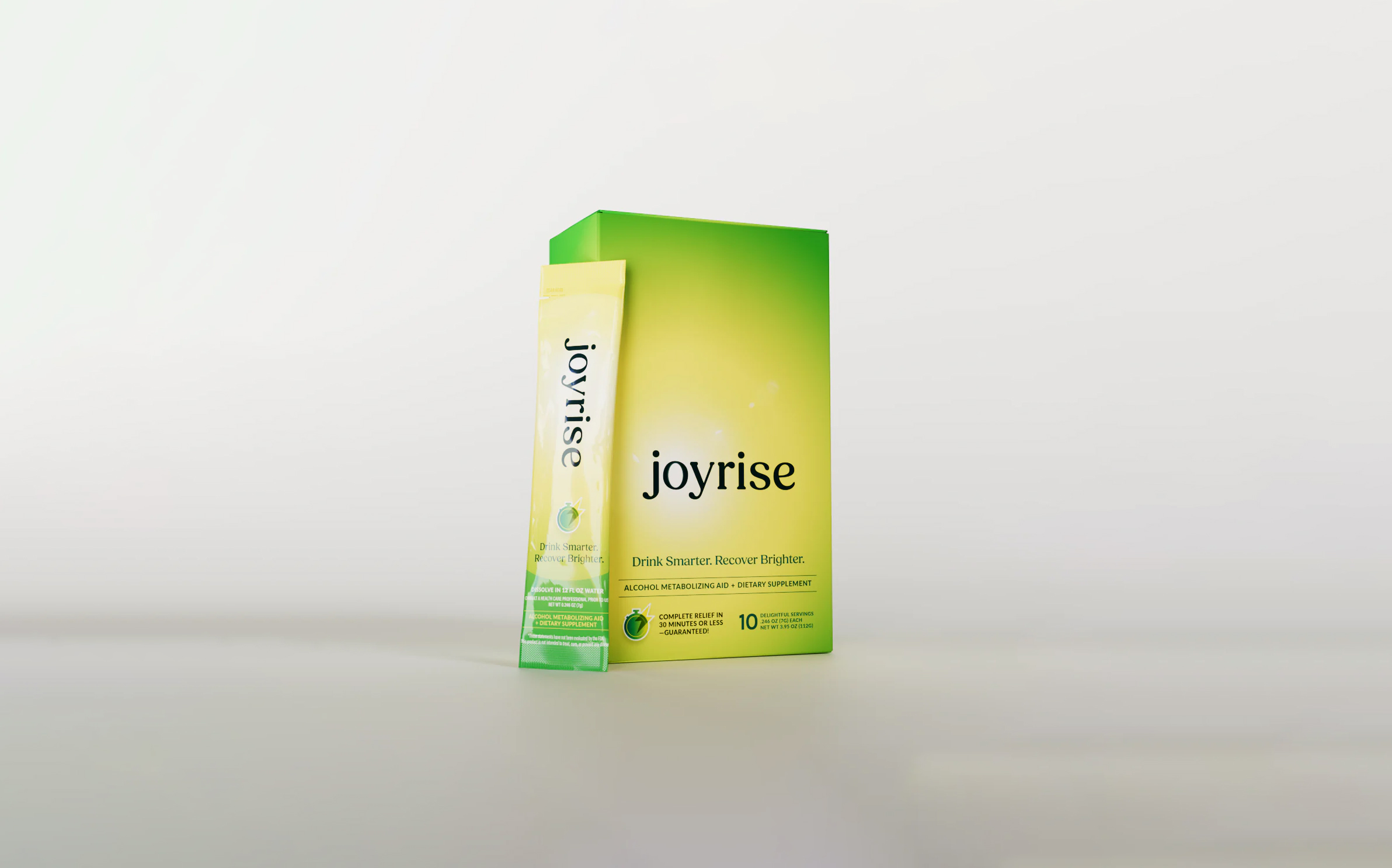
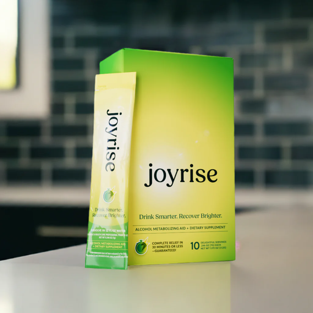
Through a highly collaborative process, we distilled dozens of name options down to JoyRise—promising consumers they can savor life’s best moments without missing a beat.
This name inspired a vibrant, gradient-based brand identity that radiates joy and captures the feeling of waking up refreshed. Paired with an upbeat and clever brand voice, JoyRise confidently stands out in a saturated market, offering the perfect balance of fun and functionality.


"Autumn's ability to lead a collaborative process while delivering creative brilliance makes her an invaluable partner. She’s my go-to for branding, packaging design, and bringing strategic clarity to complex projects."
– Patrick Smith, Project Lead, Chief Digital Advisors
.png)


Let's tackle the challenges you're facing. Reach out to connect or request a proposal.


